Vevo has spent much of the past year or so entirely revamping its product. Most music video watchers probably first encountered the brand on YouTube; many artists big and small use Vevo to power their feeds. But the company has been focused on making its website and apps for iOS,Android and Apple TV destinations unto themselves rather than something that powers music videos on other platforms.
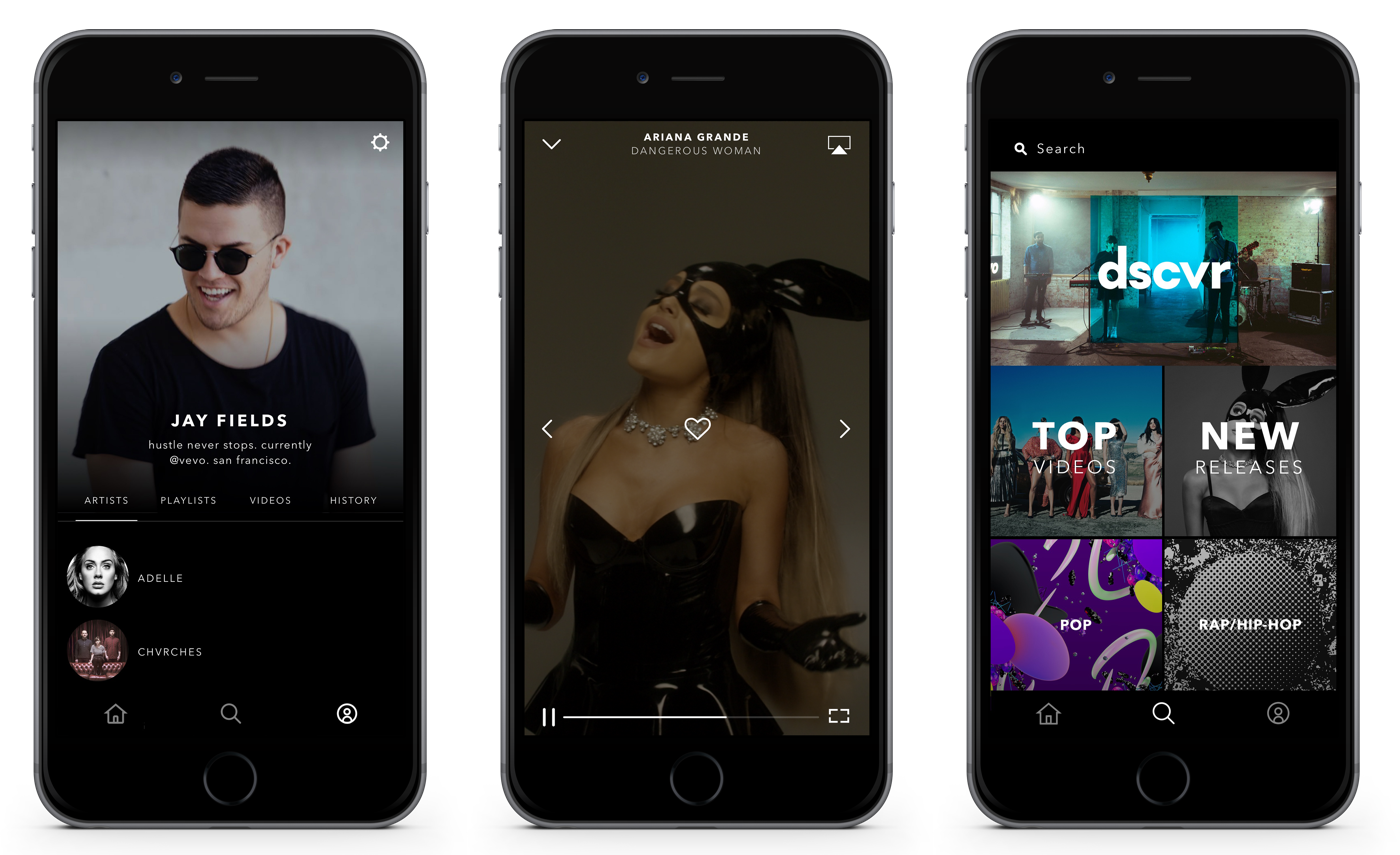
Today marks another big push in that direction: Vevo is releasing a major update (including iOS and Android apps) that highlights a number of changes made across the platform. Among those are a new portrait-oriented video player for smartphones, public user profiles that you can follow for recommendations and a smarter and more visually engaging feed that uses Vevo's vast amount of data to show you more-relevant videos. Oh, and the company has a new logo, too.
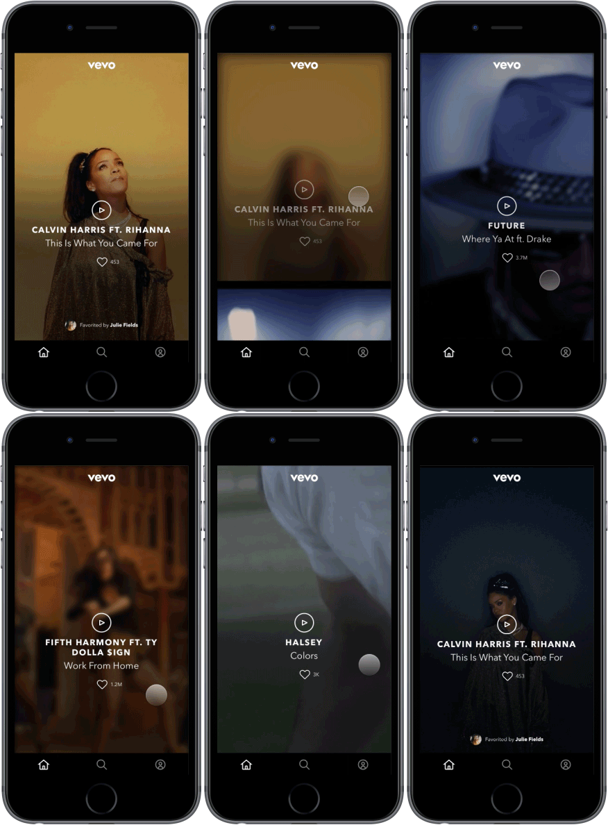
The starting point for this new experience is the Spotlight feed that you see when you open the app. After going through the on-boarding process (which involves selecting your favorite genres and artists), you'll see a feed of videos, playlists and users you might be interested in checking out. Vevo's had this feature for a few months now, but the company says it's a lot smarter now.
"We want to take your likes and the related artists of the artist that you've liked, we want to take your watch history into consideration and we want to take acoustic similarity into consideration," says Miguel Alvarado, the company's VP of data and analytics. "We'll have these three buckets of data and from there we'll create a personalized [video] list -- and we want to keep it very fresh, so every time you come to the app it's a new list."

Beyond coming up with music matches using its database, Vevo will make nods toward the human-powered music-curation trend by featuring various "Vevo Curators" in the Spotlight feed, as well. The company is targeting music bloggers, radio DJs and performers to build profiles and playlists that'll be featured in your feed. "Because of your watch history, we can match you with a curator playlist based on the stuff that you've watched before," Alvarado explains.
Being smart enough to make user behavior the basis for serving up video recommendations is the key for Vevo, though. "Our algorithms are taking the input of millions of users, so the millions of users are the curators of the system," Alvarado says. "It's not that machines are doing [the curation] -- people are doing it, but machines are helping to reach that massive scale."
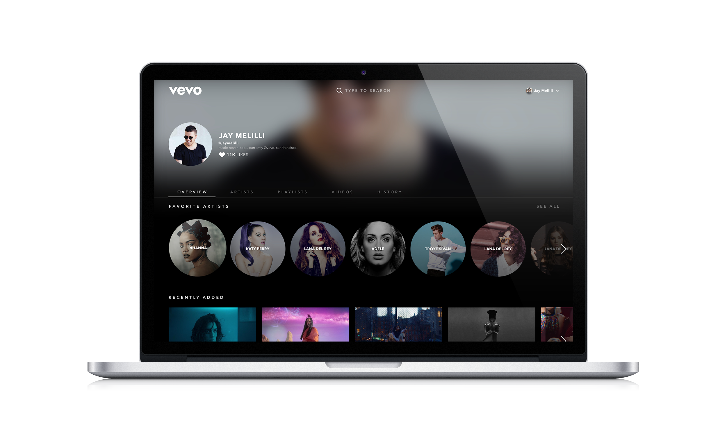
The next big change for Vevo is focused around public user profiles. Users have long had the option to create a login on Vevo, but now you can make a full-fledged public profile with all the artists and videos you've liked and playlists you've created. By default, these profiles will be private, but you can go public and start liking other user profiles; that'll give Vevo another signal to serve you videos you might want to watch. And these profiles are how the company will surface its Vevo curators in your feed.

Ultimately, it's yet another signal for Vevo to mine in order to show you better recommendations. "We're building a Venn diagram where you have algorithmic, data-powered intelligence as well as social intelligence -- and Spotlight [recommendations] are at the intersection of that," says VP of product Mark Hall. All of this focus on better recommendations is key for Vevo: When I tested out the service's new Android and Apple TV apps this past winter, I found the service's focus on top-40 pop music to be a major turnoff. But Vevo has gotten progressively better at surfacing more-diverse music based on my listening habits, and this should only help in that pursuit.
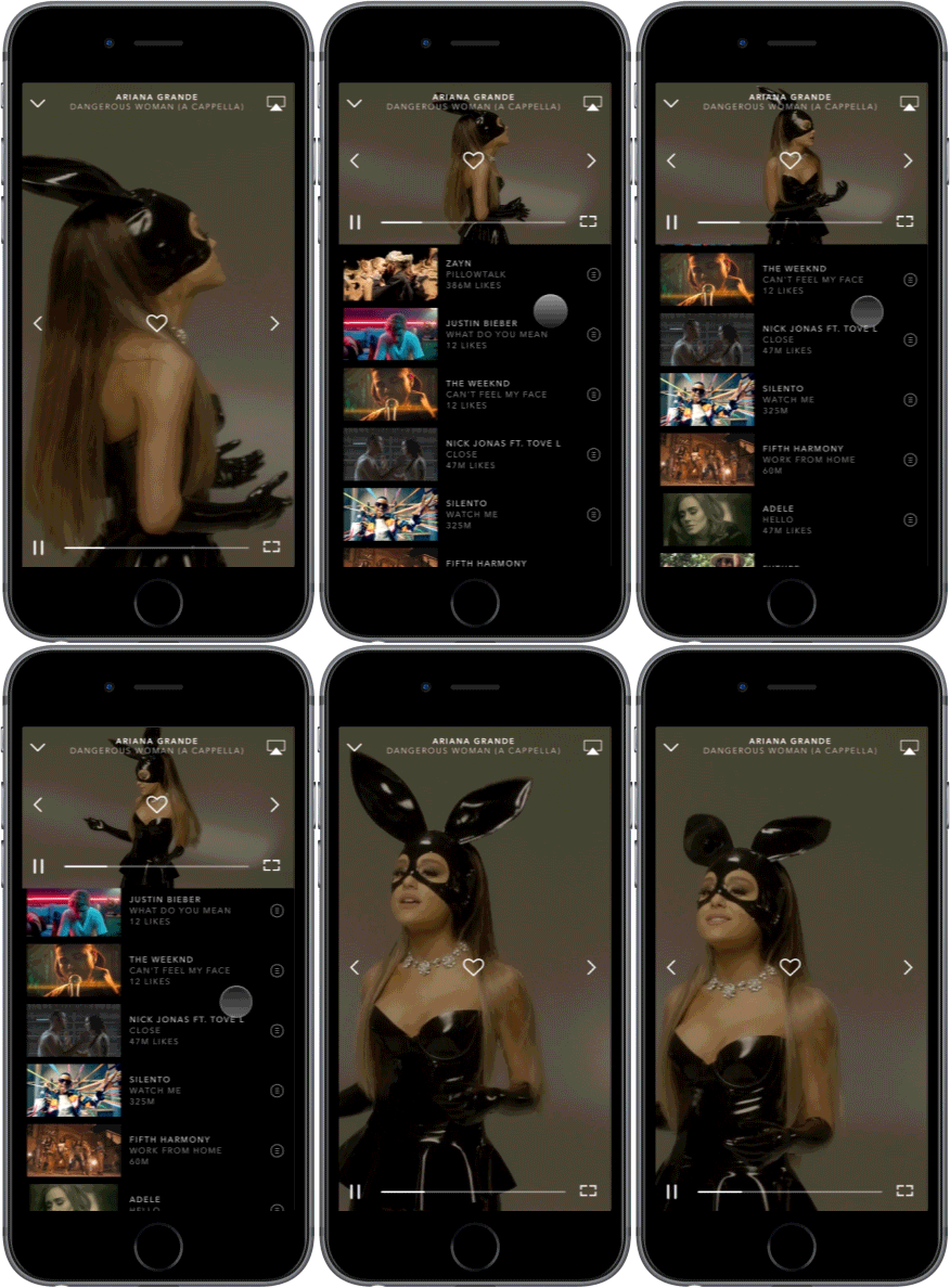
The new user profiles and updates to Spotlight will be available across all platforms, but the last big product changes are focused on making the mobile app experience more engaging. The most dramatic is that Vevo is going all in on the dreaded portrait video format. Now when you start up a video, it'll go into full screen in whatever orientation you're holding your phone. Of course, you can flip it on its side to see the full video, but if you're holding it in portrait, you'll see a view optimized to that orientation instead of a tiny view of the video at the top of your screen.

"We've done tests on some videos when you're watching in portrait full-bleed -- even though you're only seeing a segment of the video, it's plenty good," says Hall. "You're seeing most of the action, and it's paired with the audio and it's so nice not to have to [flip your phone on its side]." It's an admission that most people use their phones in portrait; this option reduces friction to getting people into the video. And you can swipe left and right to go forward and back in your feed to see more videos. Swiping up from the bottom of the screen puts the video in the top third of your screen in its full natural-aspect ratio, and you'll then see either info about the video or more details about the playlist you're watching below.
I watched a few videos like this using a demo version of the app, and I have to say I'm shocked at how natural it felt. It makes sense: Most action is usually in the center third of the frame, and while some of the crops I saw definitely felt off, the general experience didn't feel all that odd. Purists will scoff at this, but given how many people are shooting and watching portrait-oriented video at this point (thanks, Snapchat), it's a pretty smart addition to the app. "We've always had this historically difficult mismatch between landscape video and the portrait orientation we all use on our phones," Hall explains. "People have been incrementally solving towards that, but I think we've taken the next step."

In the same vein, the Spotlight feed has come to life with 15-second video clips that load and play automatically as you swipe through the feed. (These clips are available on iOS today and will be added to the Android app soon.) Eventually, Vevo wants to use its data to find the most engaging points of the video and load those to increase engagement and click-through; the video previews will also soon come to artist pages to make them more dynamic. "When you see the combination of the [Spotlight] video feed with the portrait video experience on mobile we think it's a pretty big step forward in terms of viewing video on mobile," Hall says.
Whether this will be enough to meet Vevo's ambitions remains to be seen, but the company thinks its laser focus on making the best music-video-watching experience will help it in the long run. "Right now, people have a choice between going to YouTube and going to Vevo, and that's good for us," says Hall. "That means we have to innovate and be better. Part of winning that choice is saying this is a better experience than you're going to get on YouTube."
Of course, YouTube has a massive long tail of music videos, both official and shot by fans, as well as a dedicated YouTube Music app and the Red subscription service, which makes the entire site ad-free. Google is clearly not sleeping on music, which means Vevo will have to be on top of its game. It has its own subscription service and more product updates in the pipeline. YouTube obviously isn't going anywhere, but if Vevo can continue innovating in the mobile video space, it could solidify its status as a dark horse candidate for music video aficionados.

Conversion Conversion Emoticon Emoticon